Guinness

Responsive Web Redesign

INTRODUCTION

Jira Software is a project management and issue tracking tool that helps manage projects systematically and supports smooth collaboration, especially in remote settings.
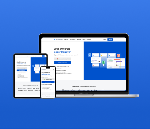
I redesigned the Jira Software website, creating a responsive page optimized for desktop, tablet, and mobile devices. This redesign aims to effectively promote the business to visitors and enhance its overall marketing effectiveness.
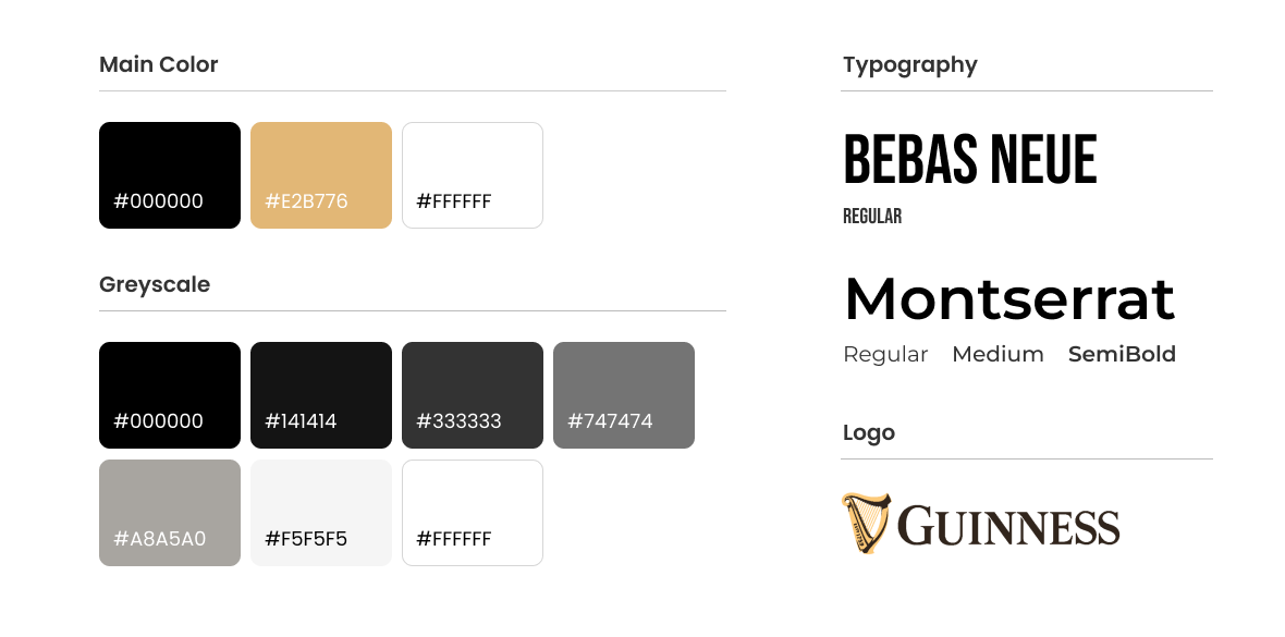
PROBLEM IDENTIFIED

For beginners who are new to Jira Software, it can be challenging to understand all the content on the website and navigate through it due to the inconvenient layout.

PROJECT TYPE

Personal Project

TIME LINE

3 weeks

MY ROLE

Research, Analysis, Grid system, UX/UI Design
How Might We introduce Guinness to people who are using it for the first time more easily?
The Redesign

Before

After

Before

After

Process
01 DISCOVER

Why was redesign needed?

I interviewed two new users of Jira Software and one user who has prior experience using it. I asked them about their experience with the current Jira landing page and whether they were able to find the desired information through it, aiming to identify any issues or shortcomings with the Jira landing page.
PROBLEM 01

조직화 되지 않은 정보

중요한 정보의 디자인이 강조되지 않아 서비스의 기능을 사용자가 직관적으로 알기 어렵습니다. 지라 소프트웨어의 기능을 처음 접하는 유저에게도 쉽고 빠르게 다가갈 수 있도록 레이아웃을 정리할 필요가 있습니다.
PROBLEM 02

조직화 되지 않은 정보

중요한 정보의 디자인이 강조되지 않아 서비스의 기능을 사용자가 직관적으로 알기 어렵습니다. 지라 소프트웨어의 기능을 처음 접하는 유저에게도 쉽고 빠르게 다가갈 수 있도록 레이아웃을 정리할 필요가 있습니다.
02 DESIGN

GRID SYSTEM

Flexible grids are foundational elements of responsive design because they play a central role in providing great UX, no matter what device people use.

Desktop

1920px - 12 columnes

Tablet

1024px - 8 columnes

Mobile

375px - 4 columnes

STYLE GUIED

Flexible grids are foundational elements of responsive design because they play a central role in providing great UX, no matter what device people use.
03 DEVELOP

What’s New?

사용자의 관심과 흥미를 유도할 수 있도록 생동감있는 인터렉
04 DELIVER

HIGH FIDELITY DESIGN : Main page

Desktop 1920px • Tablet 1024px • Mobile 375px

HIGH FIDELITY DESIGN : Sub page

Desktop 1920px • Tablet 1024px • Mobile 375px
What I Learned
  • I realized the importance of considering various design elements such as layout, spacing, font size, and more through the responsive website redesign project. It has highlighted the significance of paying attention to these aspects for an enhanced user experience.
  • I have come to realize the importance of continuously considering user experience and accessibility across all devices. It is essential to prioritize these aspects to ensure a seamless experience for all users.
Next Step
  • The landing page should have a systematic hierarchical structure and an organized information flow, taking into consideration user behavior patterns to efficiently convey information. Beyond information delivery, I believe it is crucial to create an enjoyable user experience. Therefore, in the next phase, we plan to focus on developing interactive designs to make Jira Software's website more appealing and intuitive to users.